Two different faults, one near-identical power curve
Spotting a problem on the power curve is the easy part. Two very different faults can produce almost the same curve, and telling them apart needs more than the curve.
The easy part of wind turbine performance analysis is spotting a problem on the power curve. The hard part is diagnosing what is causing it.
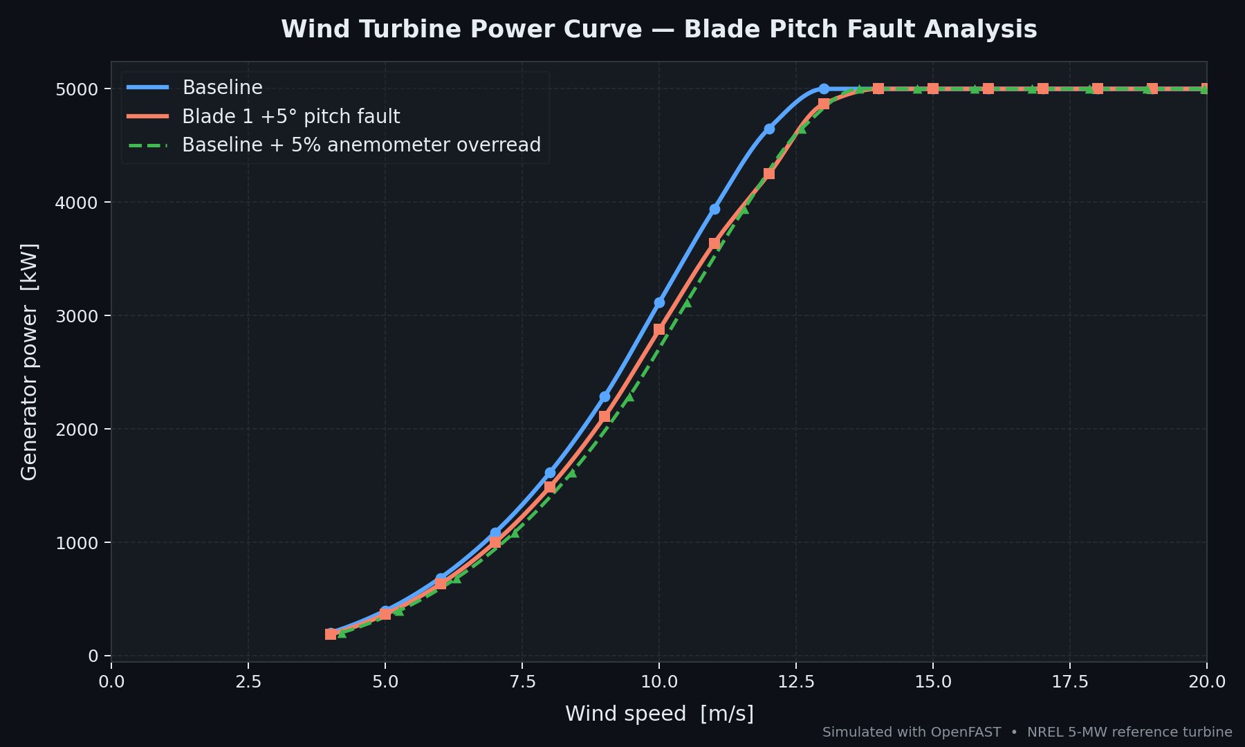
This plot shows two simulated faults on an NREL 5 MW reference turbine using aeroelastic modelling. One has a 5 degree pitch offset on a single blade. The other has a nacelle anemometer overreading by 5%. The result is two very similar looking power curves.
But the causes are completely different. One could be a blade encoder error or even an incorrect blade installation. The other needs an anemometer replacement or recalibration. Get it wrong and the O&M team are trying to fix something that is not broken.
This is why power curve checks alone are not enough. Diagnosing underperformance requires looking at the data beyond just the power curve.
Look at the loads, not just the power
Although the two power curves look alike, the structural loads are not. The peak-to-peak fore-aft tower base moment is about 18 times larger for the pitch fault than for the baseline.
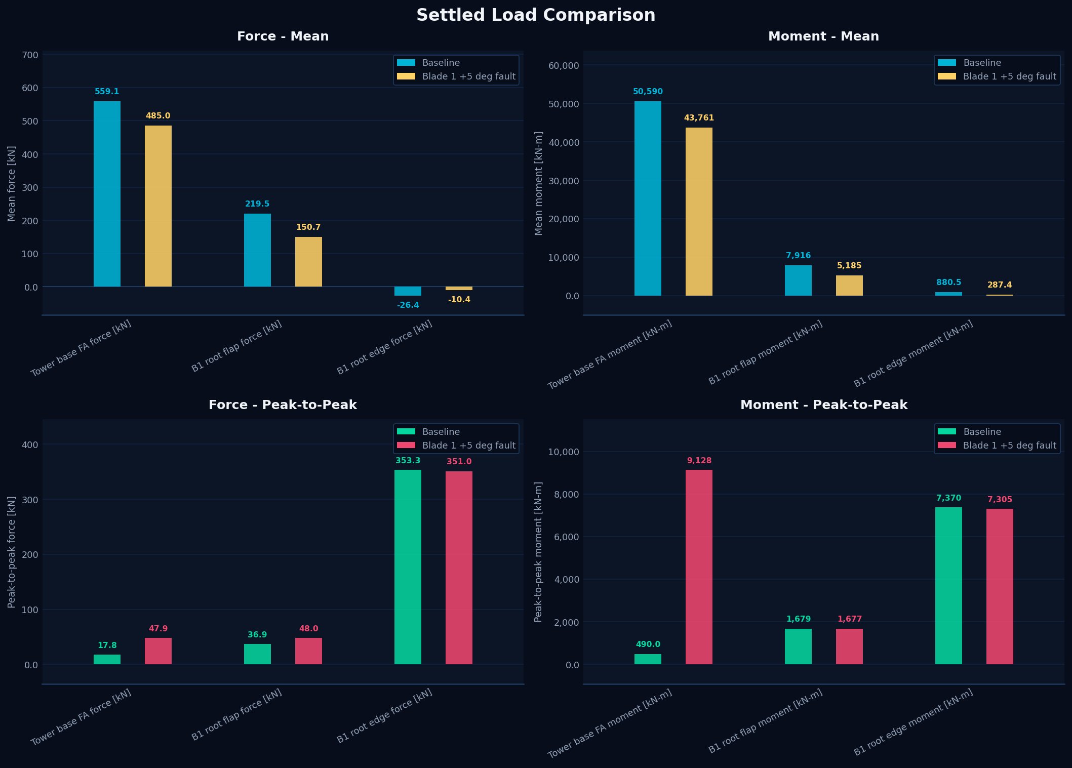
Interestingly, the mean of several loads is slightly lower for the pitch fault. The reduced angle of attack on the affected blade lowers its power, so the fault raises cyclic loading while slightly reducing mean output.
The 1P signature
A single-blade pitch fault loads the rotor unevenly, once per revolution. That shows up as a strong 1P peak in the load spectrum. An FFT of the tower base fore-aft moment makes it obvious.
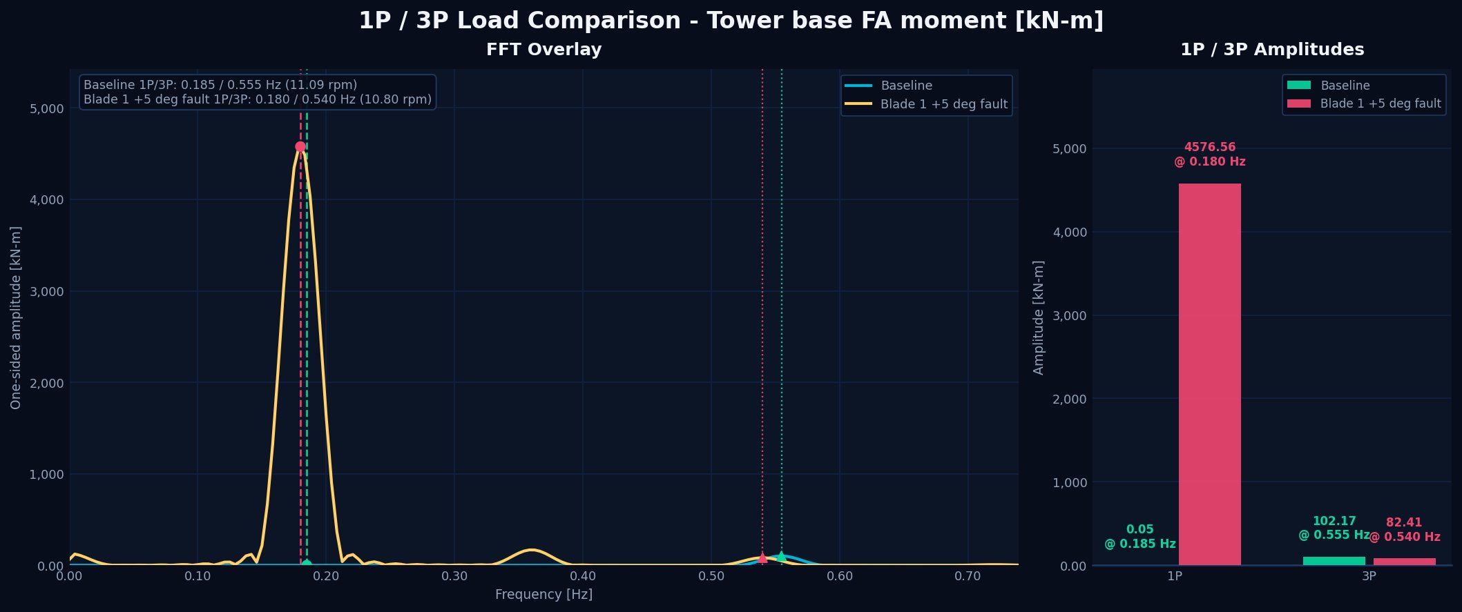
This is a theoretical, perfectly mass-balanced rotor, so the contrast is at its most extreme. A real rotor is never perfectly balanced, so the difference would be less stark.
In practice, few turbines carry tower base load monitoring. Newer machines may measure blade root or main shaft loads, and many have tower top accelerometers, which can also reveal a 1P signature where the data is accessible.
The bottom line
Most O&M KPIs are availability driven. A turbine producing 95% of expected energy does not trigger alarms. It just quietly loses revenue, month after month. Power curve checks find the symptom. Diagnosing the cause needs analysis beyond the curve.
Charts and analysis by PowerVeritas. Where open datasets are used, sources are credited on the attributions page.