
Can a nacelle anemometer measure turbulence?
The nacelle anemometer gets mean wind speed right and turbulence intensity wrong in a specific way. Four months against a nacelle lidar show what it misses and what other SCADA tags recover.

Short, evidence led notes and worked examples on wind, solar and battery storage analysis.
The nacelle anemometer gets mean wind speed right and turbulence intensity wrong in a specific way. Four months against a nacelle lidar show what it misses and what other SCADA tags recover.

The nacelle transfer function is measured while the rotor turns. Parked, the same anemometer reads low, and downtime losses calculated from it are understated.

A primary anemometer that over read triggered 53 false high wind stops in eleven days. Roughly 50 MWh lost, split between stopped hours, storm derating and ramping back up.

Identical bulbs fail within days of each other. Assessed fatigue life across one wind farm can vary by more than ten years, and that changes which turbines an inspection should target.

Sun angle and heat pull output in opposite directions. Three months of five minute data show why the angle of the sun has to be corrected first and what heat costs across a year.

Hot air is less dense air. Two years of open SCADA data show the same wind speed producing around 14% more power in cold air than hot and why a density correction belongs in every performance assessment.

The door cutout creates a stress concentration at the base of every tower, and rainwater run-off makes the weld around it prone to corrosion. Why this detail belongs in every lifetime extension inspection scope.

Fifty years of reanalysis at one Scottish site shows a near flat trend for wind and energy, but year-to-year swings of up to 16%. Variability, not climate, is what breaks single year budgets.

Wind turbine blade failures are no longer rare. Why the rate is rising and where the industry should focus, from incident sharing to inspection, monitoring and the certification test basis.

A turbine's reported wind speed is a corrected reading, not a raw one. What the correction does and how well it holds up against an independent lidar.

A measured power curve that drops over the years looks like ageing. Several other causes produce the same shift, and only one is real degradation.

A simple visual check on a turbine foundation can have a real impact on the life of the asset.

State of charge is one of the most important numbers for a battery asset and one of the hardest to measure accurately.

How a simple sensor cross-check, a distribution comparison and a site wide ratio map together separate a single faulty anemometer from genuine turbine underperformance.

In complex terrain, the direction the wind approaches from can noticeably change a turbine's observed power curve.
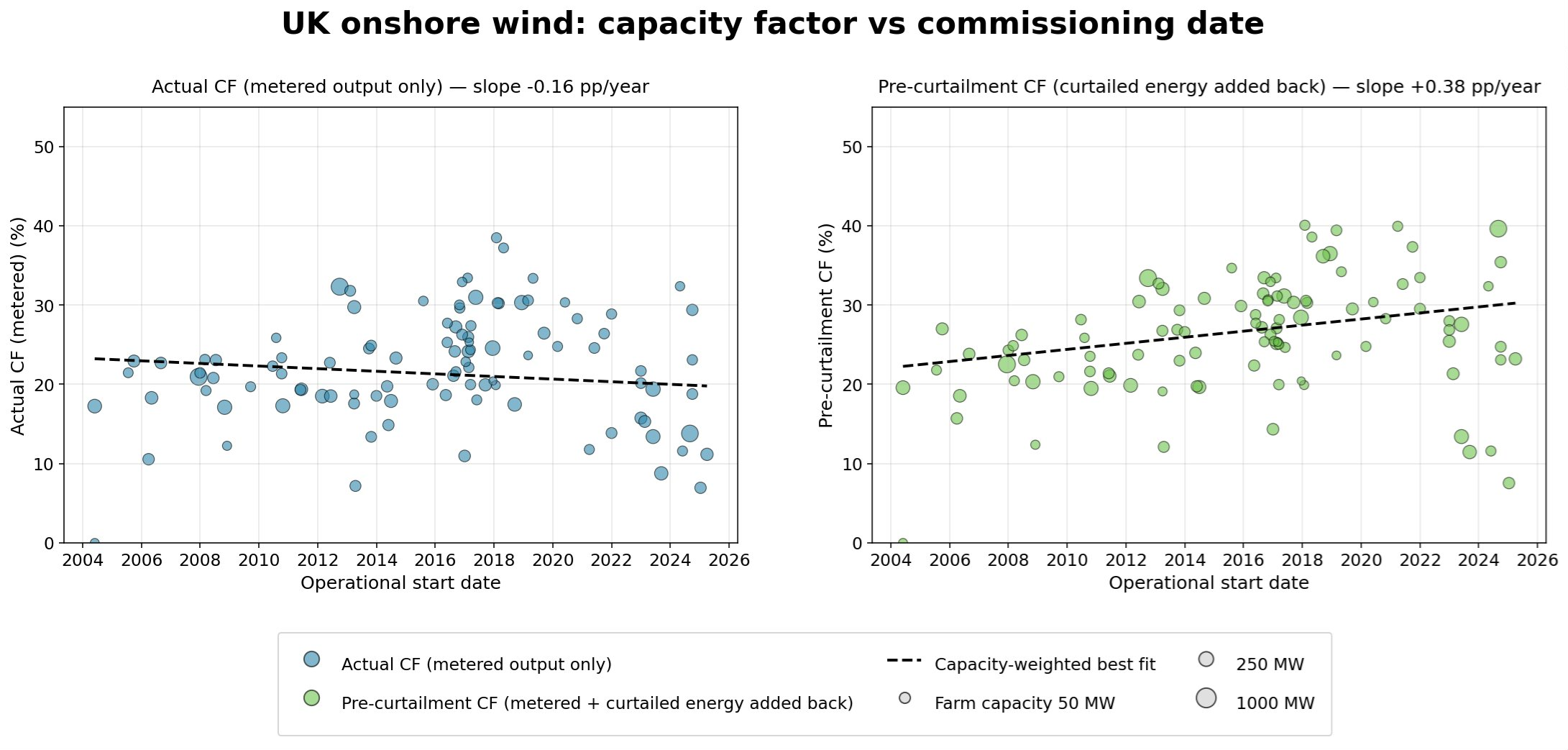
Headline capacity factors have barely moved since 2004. Add back curtailed energy and the real trend points clearly upward.
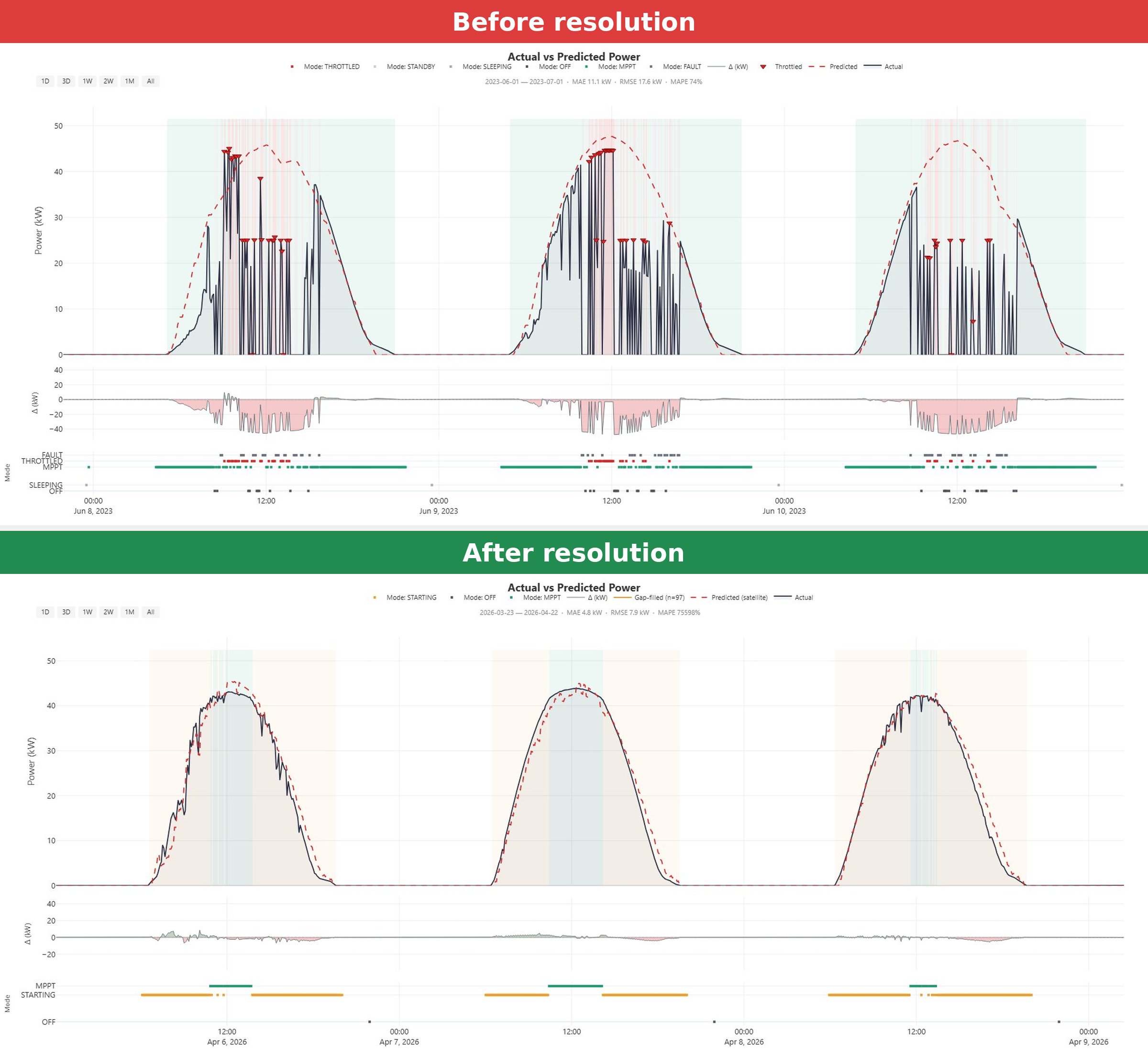
A solar inverter looked like it was suffering normal grid curtailment. The real cause was high grid voltage at the connection point, and it was fixable.
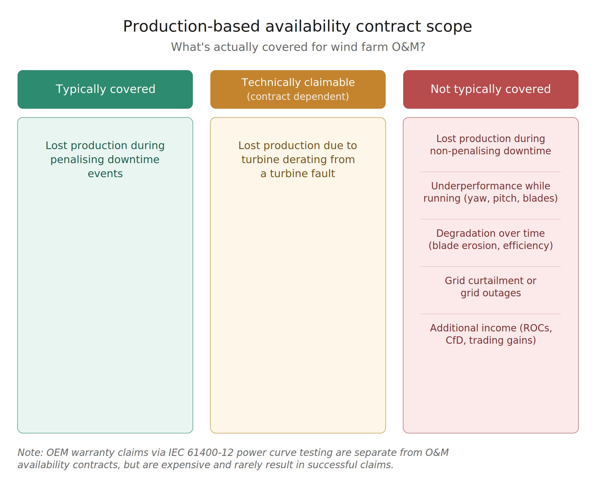
Production based availability contracts cover less than many owners assume. Here is what typically falls outside the guarantee.
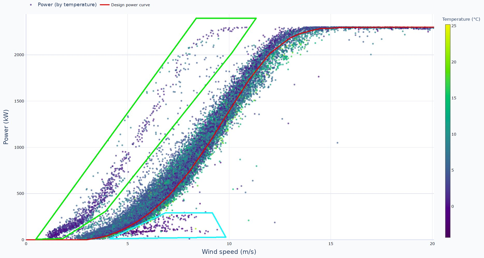
A power curve can show two patterns that both look like icing. The time series context reveals that only one of them actually is.

Spotting a problem on the power curve is the easy part. Two very different faults can produce almost the same curve, and telling them apart needs more than the curve.