Two icing signatures on a power curve, only one is genuine
A power curve can show two patterns that both look like icing. The time series context reveals that only one of them actually is.
This power curve contains two potential icing issues, but only one is genuine icing.
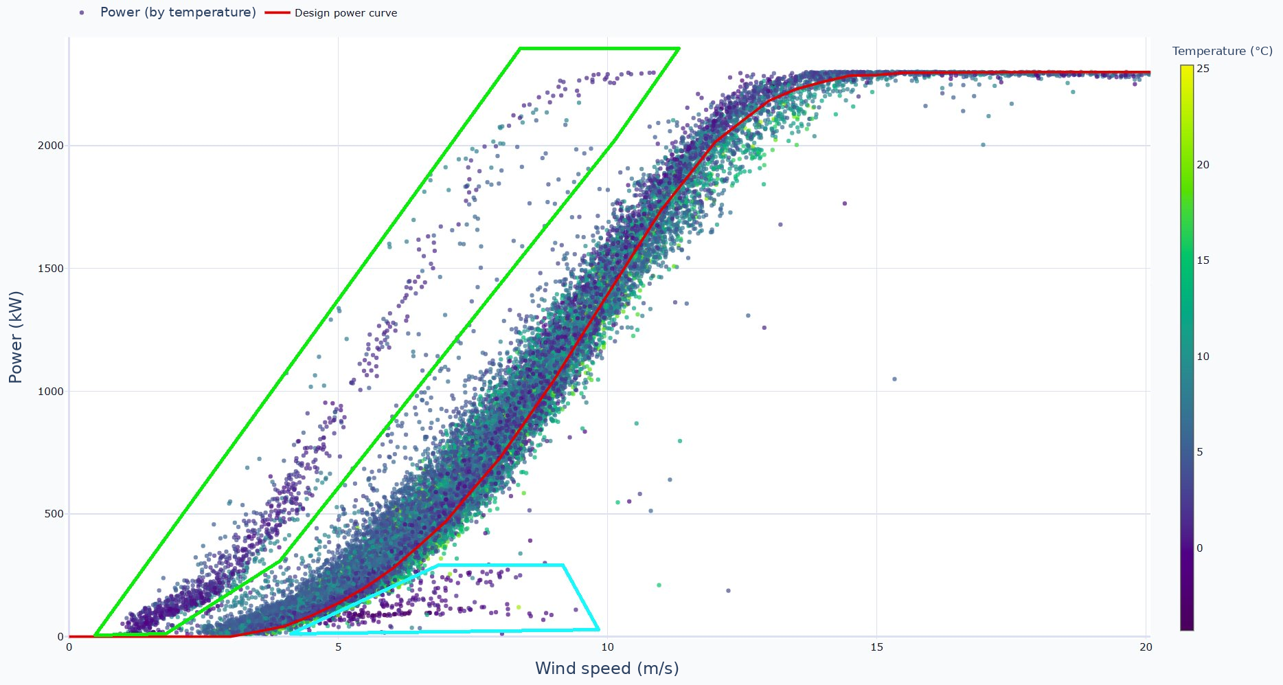
The scatter to the right of the power curve, in the blue box, occurs around 0°C and is caused by blade icing. Ice on the blades degrades their aerodynamic performance and can cause sections to stall, leading to underperformance and often a low torque icing alarm that shuts the turbine down.
The scatter to the left of the power curve, in the green box, also occurs mostly around 0°C. At first glance this looks like anemometer icing, on a cup rather than a sonic sensor, where ice on the cups slows the anemometer down, causing it to under-read and making the turbine appear to over-produce.
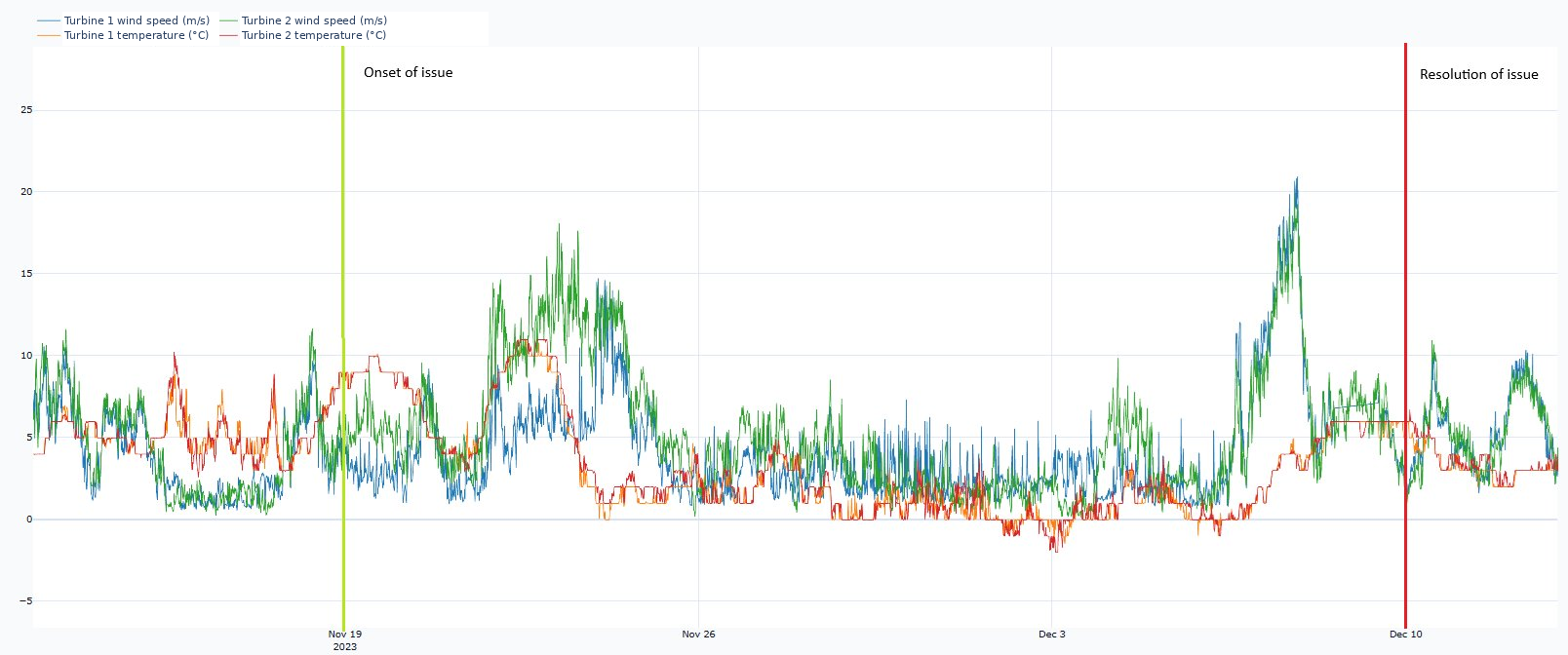
A closer look at the temperature trend at the onset of each issue tells the real story. The blade icing scatter starts after temperatures drop below 0°C and resolves once they rise back above. The other issue starts when ambient temperature is around 9°C, which is well above icing temperatures, even though temperatures do then drop to near 0°C during the fault period. The actual issue is a faulty primary anemometer.
The lesson
Looking at the wider time series context, not just the power curve in isolation, is essential for getting the diagnosis right.
Charts and analysis by PowerVeritas. Where open datasets are used, sources are credited on the attributions page.