When a power curve falls, is the turbine really ageing?
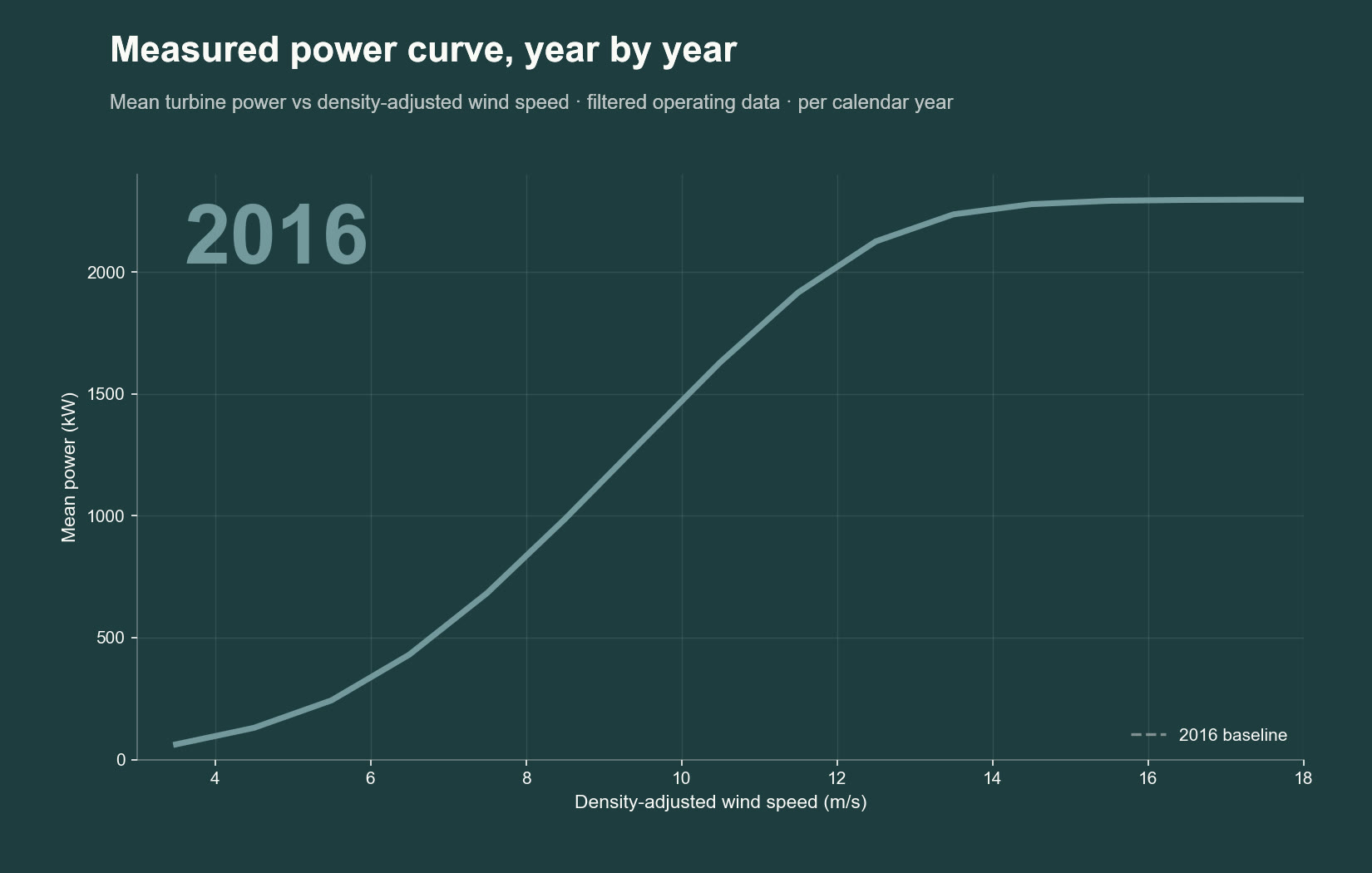
A measured power curve that drops over the years looks like ageing. Several other causes produce the same shift, and only one is real degradation.
Short, evidence-led notes and worked examples on wind, solar and battery storage performance.
A measured power curve that drops over the years looks like ageing. Several other causes produce the same shift, and only one is real degradation.
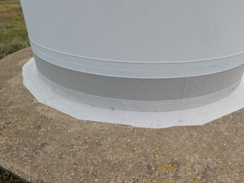
A simple visual check on a turbine foundation can have a real impact on the life of the asset.
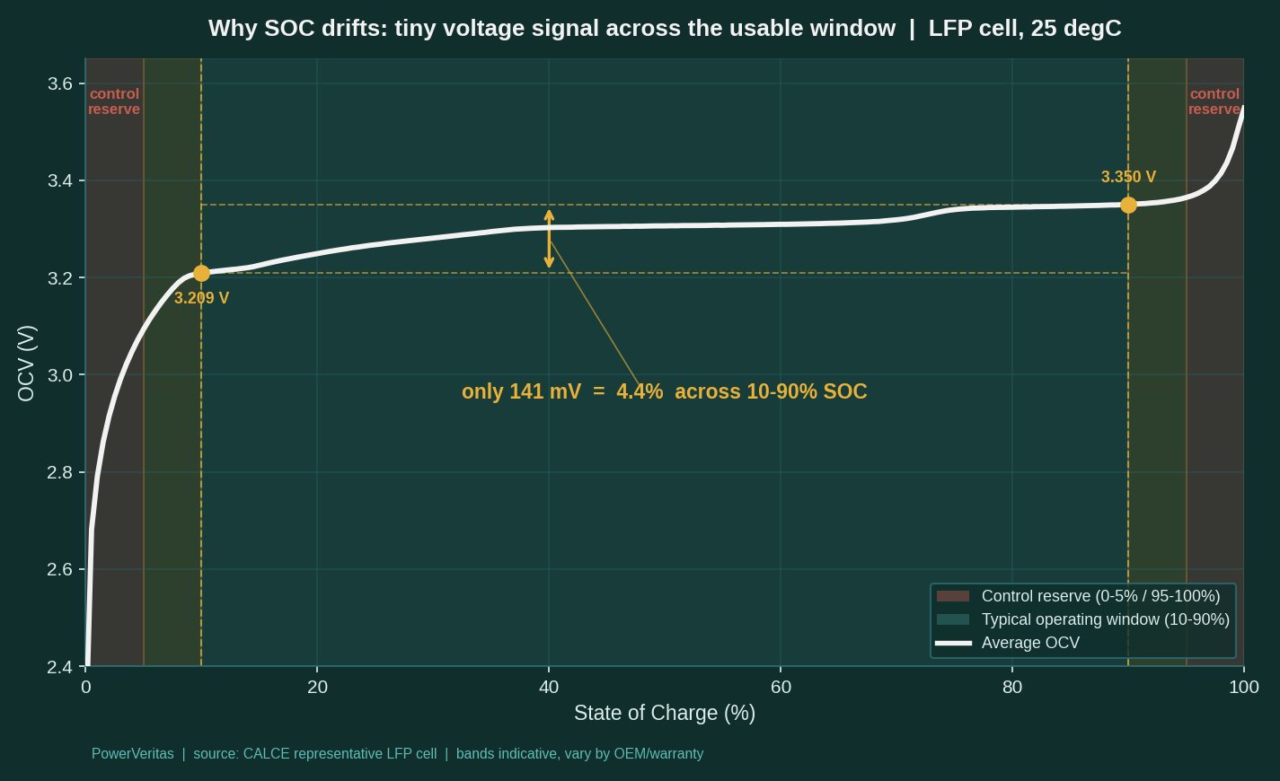
State of charge is one of the most important numbers for a battery asset, and one of the hardest to measure accurately.
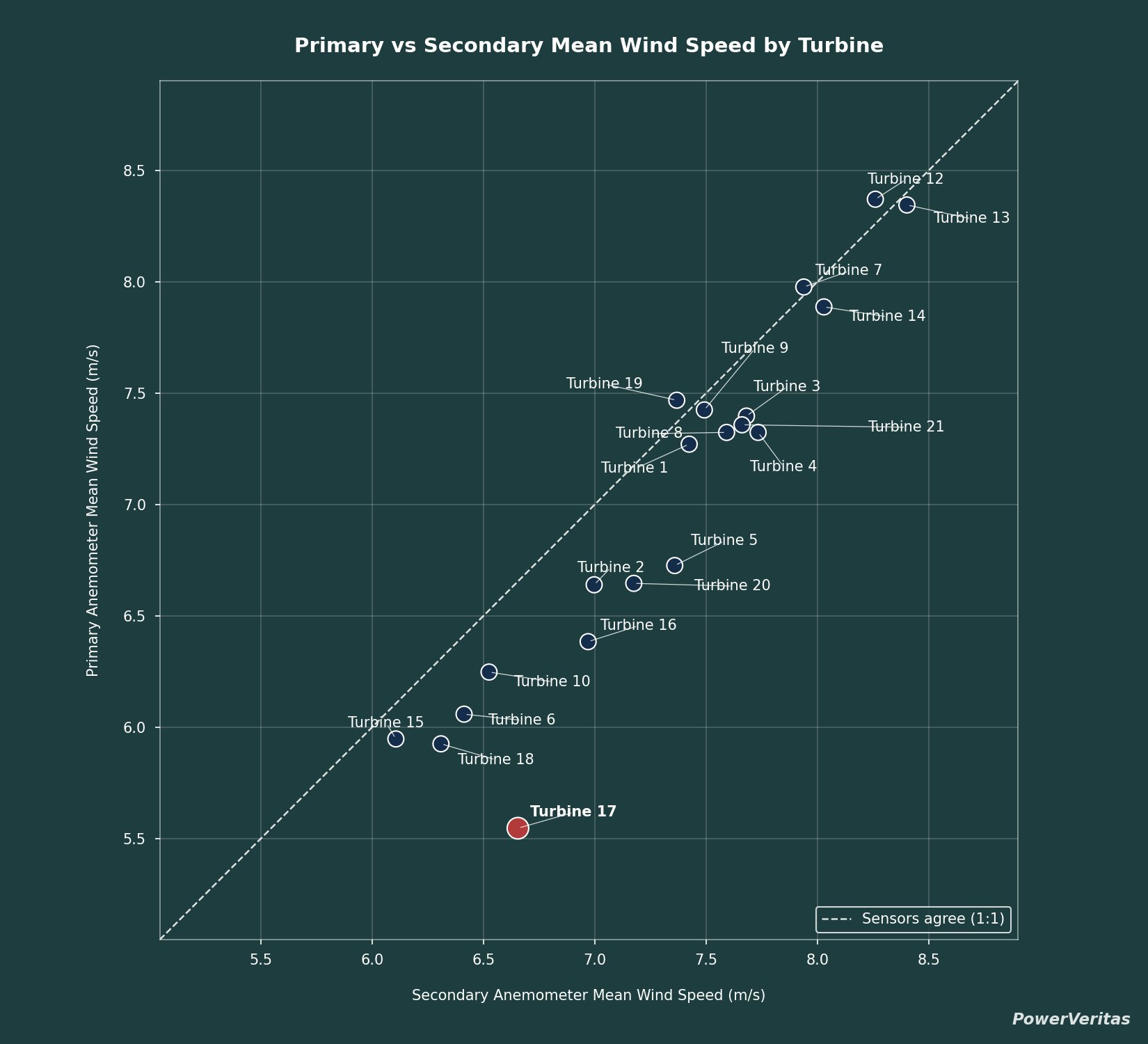
How a simple sensor cross-check, a distribution comparison and a site-wide ratio map together separate a single faulty anemometer from genuine turbine underperformance.
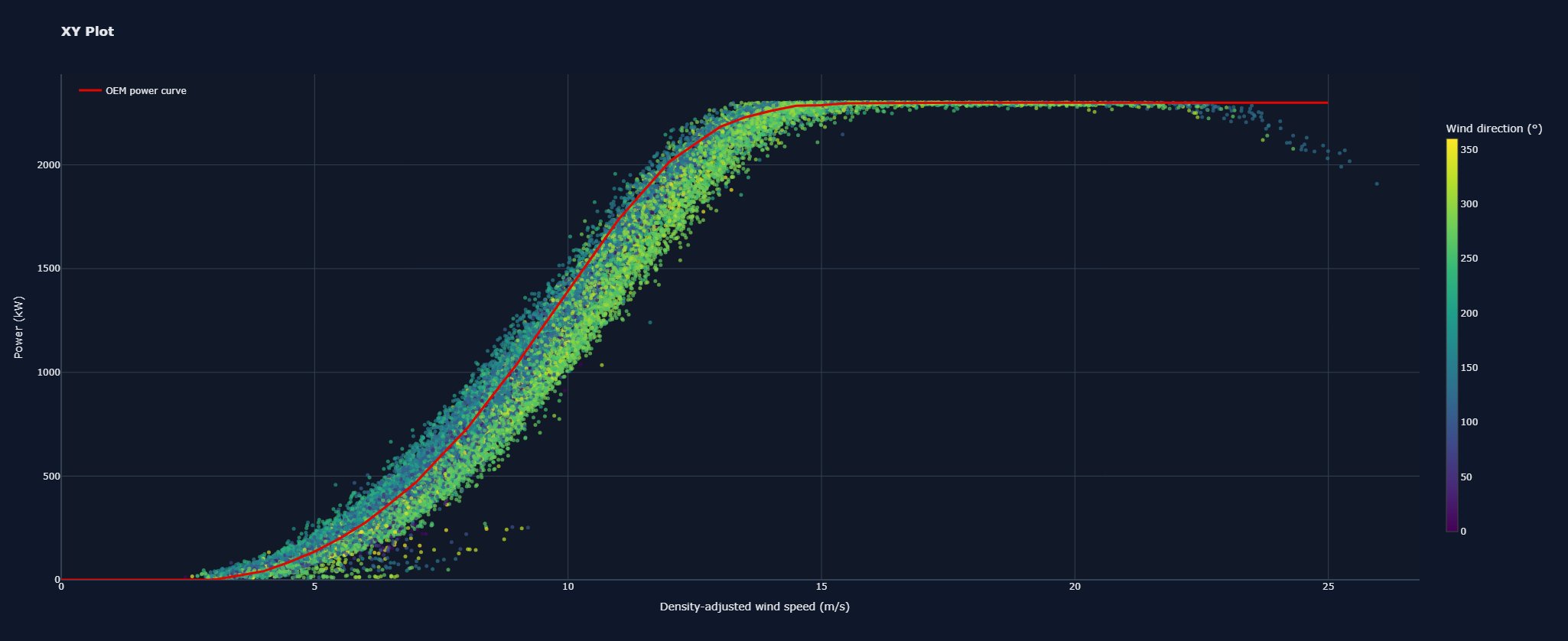
In complex terrain, the direction the wind approaches from can noticeably change a turbine's observed power curve.
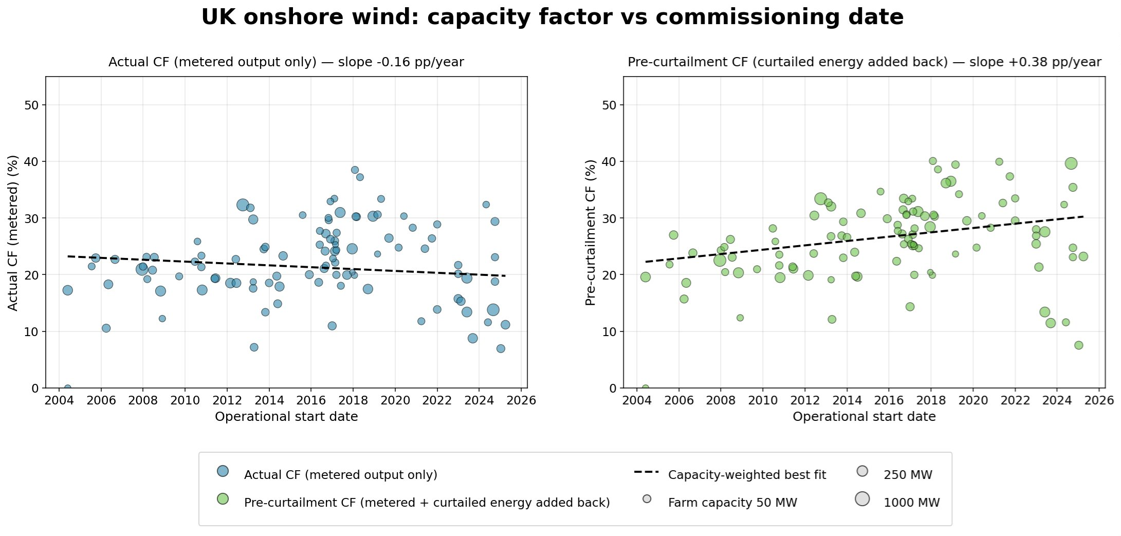
Headline capacity factors have barely moved since 2004. Add back curtailed energy and the real trend points clearly upward.
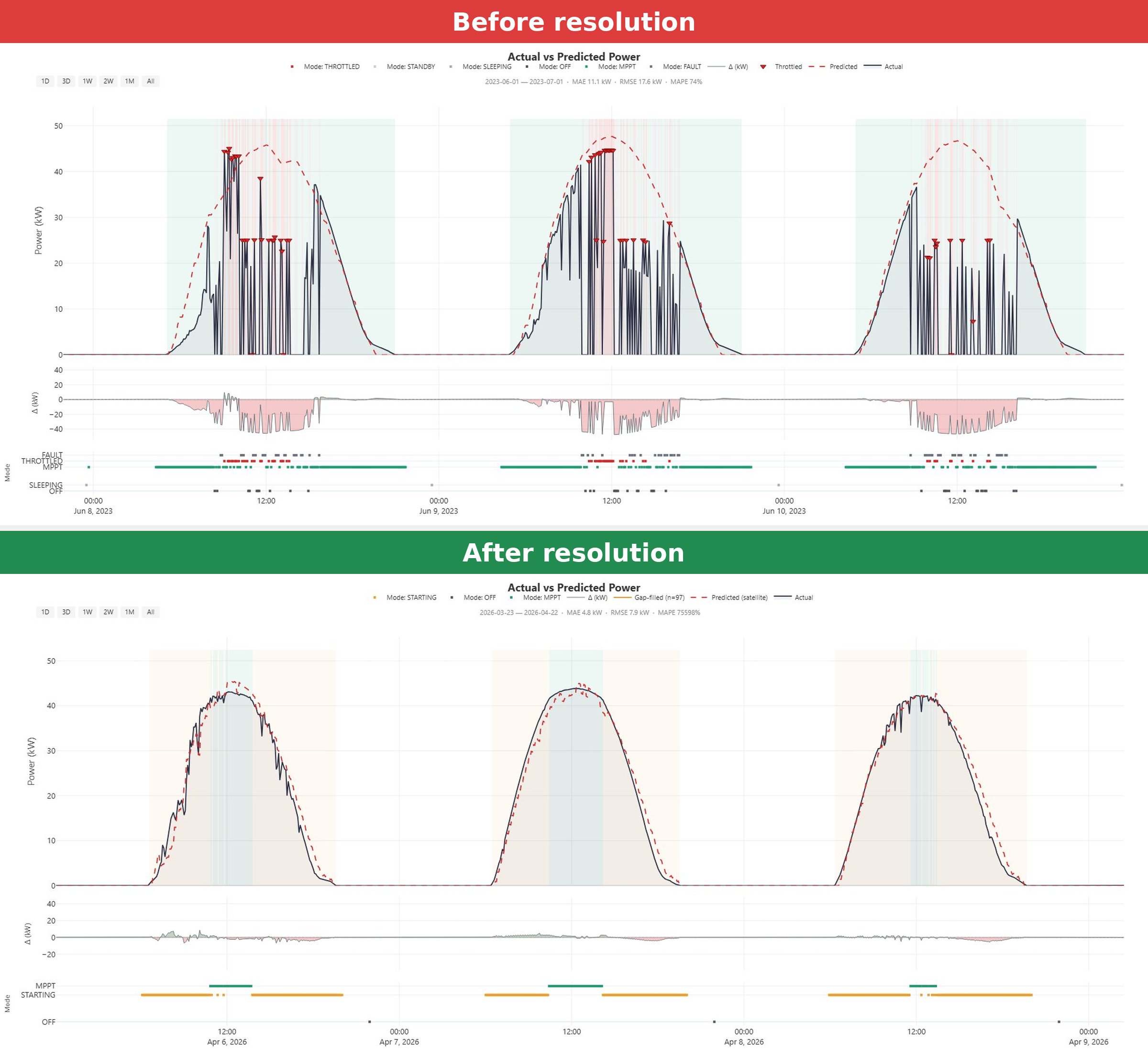
A solar inverter looked like it was suffering normal grid curtailment. The real cause was high grid voltage at the connection point, and it was fixable.
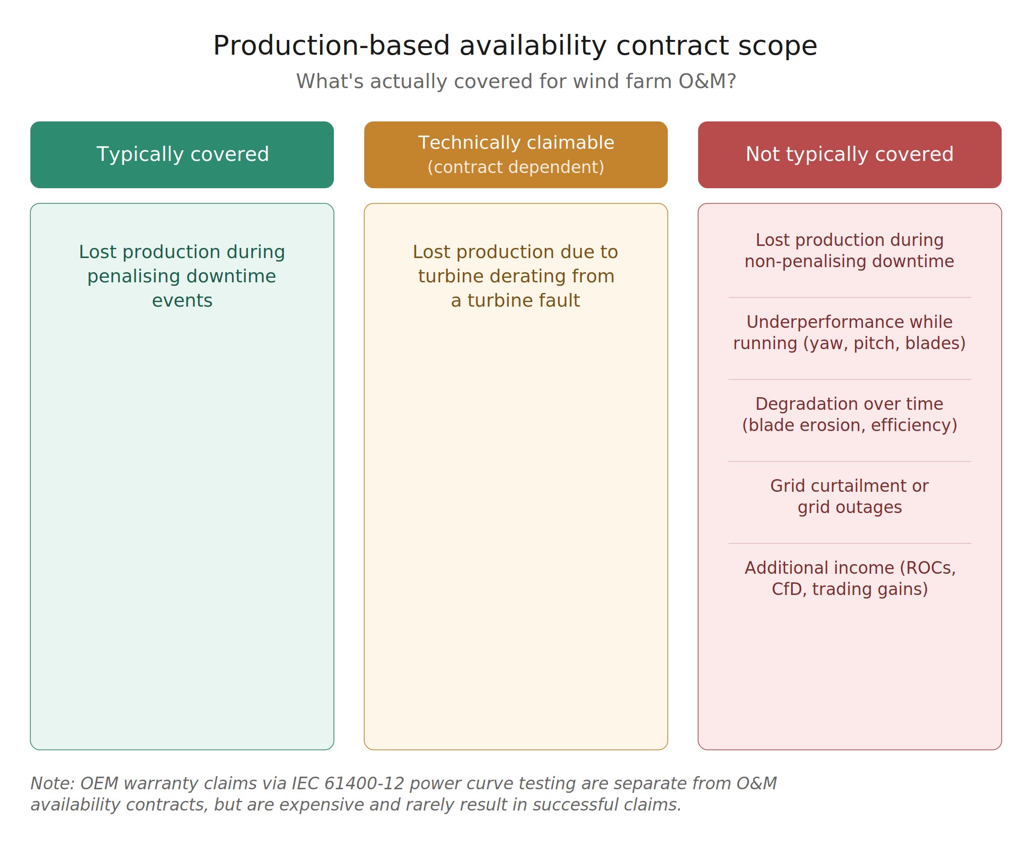
Production-based availability contracts cover less than many owners assume. Here is what typically falls outside the guarantee.
A power curve can show two patterns that both look like icing. The time series context reveals that only one of them actually is.
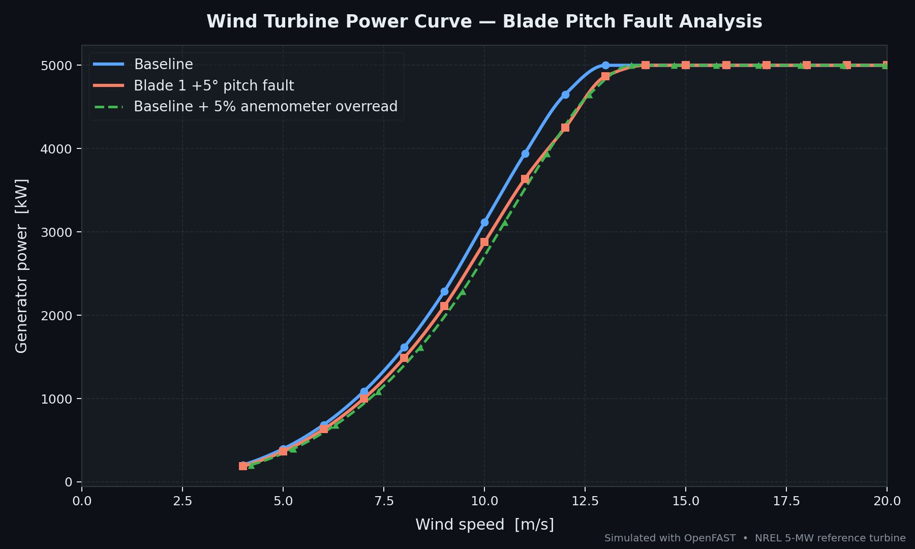
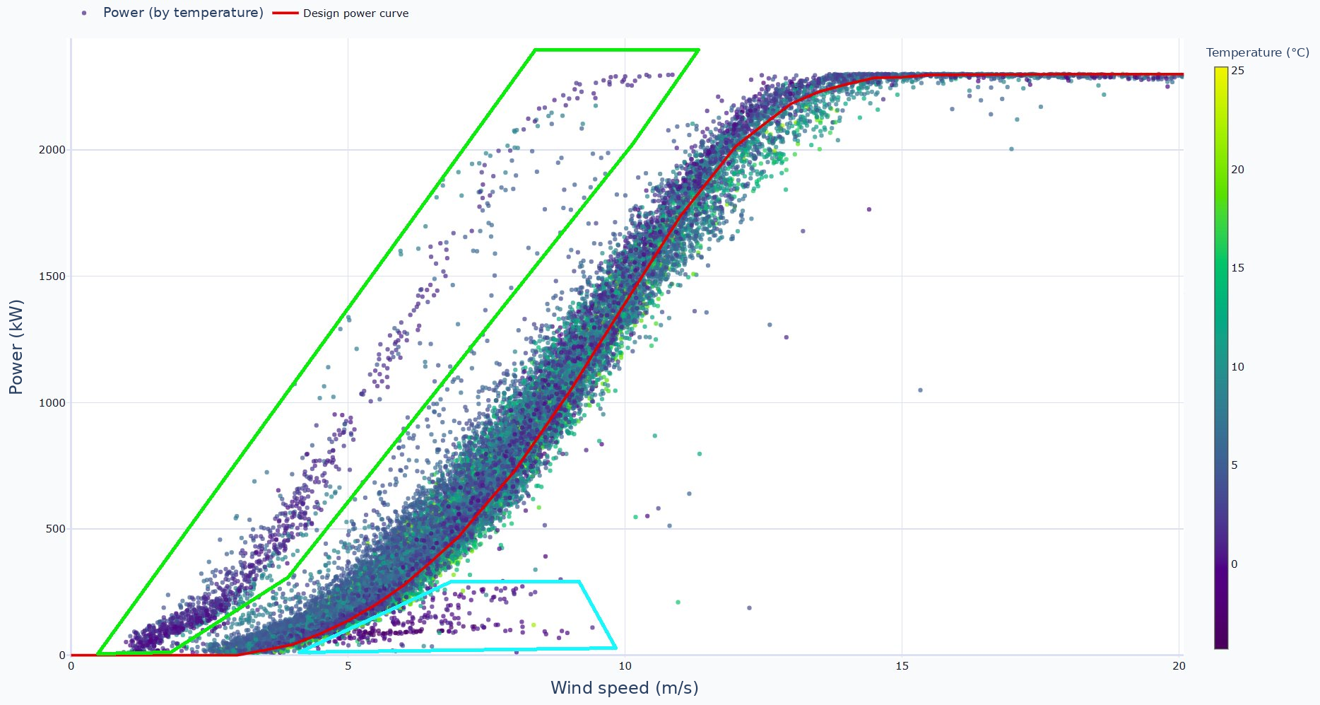
Spotting a problem on the power curve is the easy part. Two very different faults can produce almost the same curve, and telling them apart needs more than the curve.