How wind direction shapes a power curve in complex terrain
In complex terrain, the direction the wind approaches from can noticeably change a turbine's observed power curve.
The plot below shows a clear directional pattern. For some wind directions the turbine tracks the OEM power curve well. For others there is noticeable underperformance at the same measured wind speed.
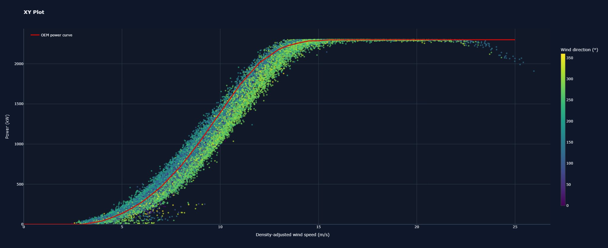
This turbine sits on a steep slope, so different wind sectors see very different flow conditions depending on whether the flow travels up the slope, down it, or across it. That introduces different combinations of inflow angle, shear, veer, turbulence and measurement effects.
It is a useful reminder that power curve analysis can hide important behaviour when all wind directions are grouped together.
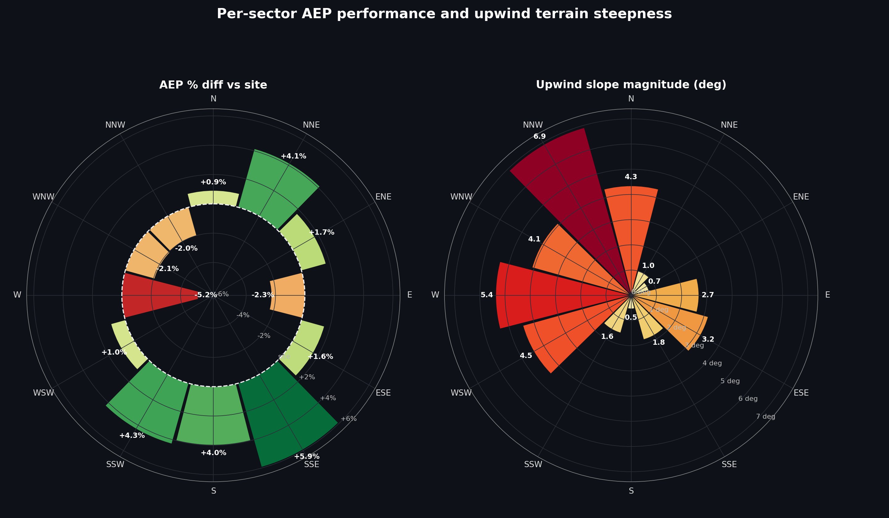
Going further, sector by sector
The second plot makes the terrain link explicit. The left side shows the percentage AEP difference to the site mean, using each 30 degree wind sector as the power curve for the full year. The right side shows the upwind slope angle, measured 2 to 5 rotor diameters ahead of the turbine.
The turbine sits on top of a ridge, with a steep north-west-facing slope, a less steep east-facing slope, a plateau to the south, and a flat ridge line to the north east.
Broadly, where the upwind slope is steeper the AEP loss against site mean is higher, and where it is flatter the AEP gain is higher. It is not a perfectly clean relationship, since a couple of steep sectors sit near zero, but the pattern is clear.
Charts and analysis by PowerVeritas. Where open datasets are used, sources are credited on the attributions page.